
Today we are (virtually) jetting off to Moscow, Russia to revisit the branding we completed for Metropolis, which was and probably still is Moscow’s most popular shopping destination….
The project came to us on the back of the successful rebranding we did for Morgan and Stanley’s Galeria in St Petersburg in which we designed an elegant logo combining the Roman and Cyrillic versions of the letter G to create a modern yet timeless visual identity.
A year later in 2013, Morgan Stanley then brought Metropolis. The investment of $2.3bn in these two shopping centres was a record-breaking transaction and the largest-ever commercial real-estate deal in Russia. Although Metropolis was already one of most visited SEC in Russia, the new owners wanted to make it clearly positioned as the number one fashion destination in Moscow.
The first question both us and the client wanted to answer was, how can we make something that is already the best even better?
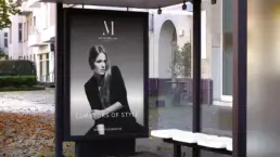
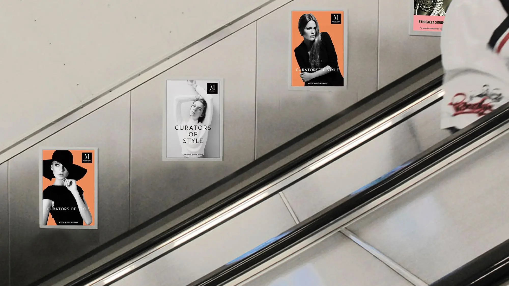
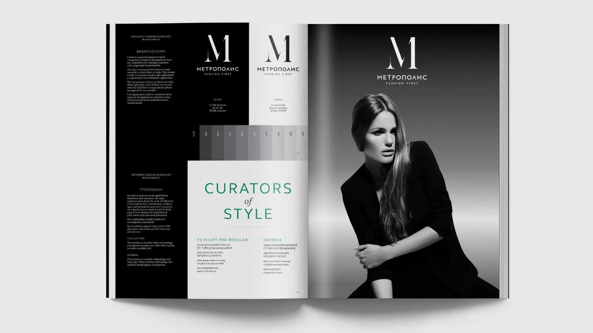
Our contemporary and sophisticated branding transitioned Metropolis from a standardised, mass-market mall to Moscow’s “Curators of Style” which now brings the most in-demand and fashion-forward trends to the younger generation and is home to the most iconic fashion brands in the world. Our branding helped attract big brands such as Karl Lagerfeld, Micheal Kors and Superdry into the Western style mall of Russia.
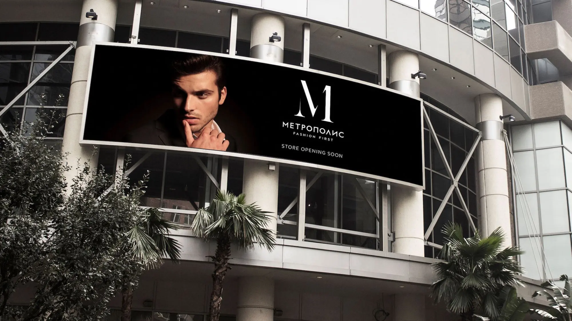
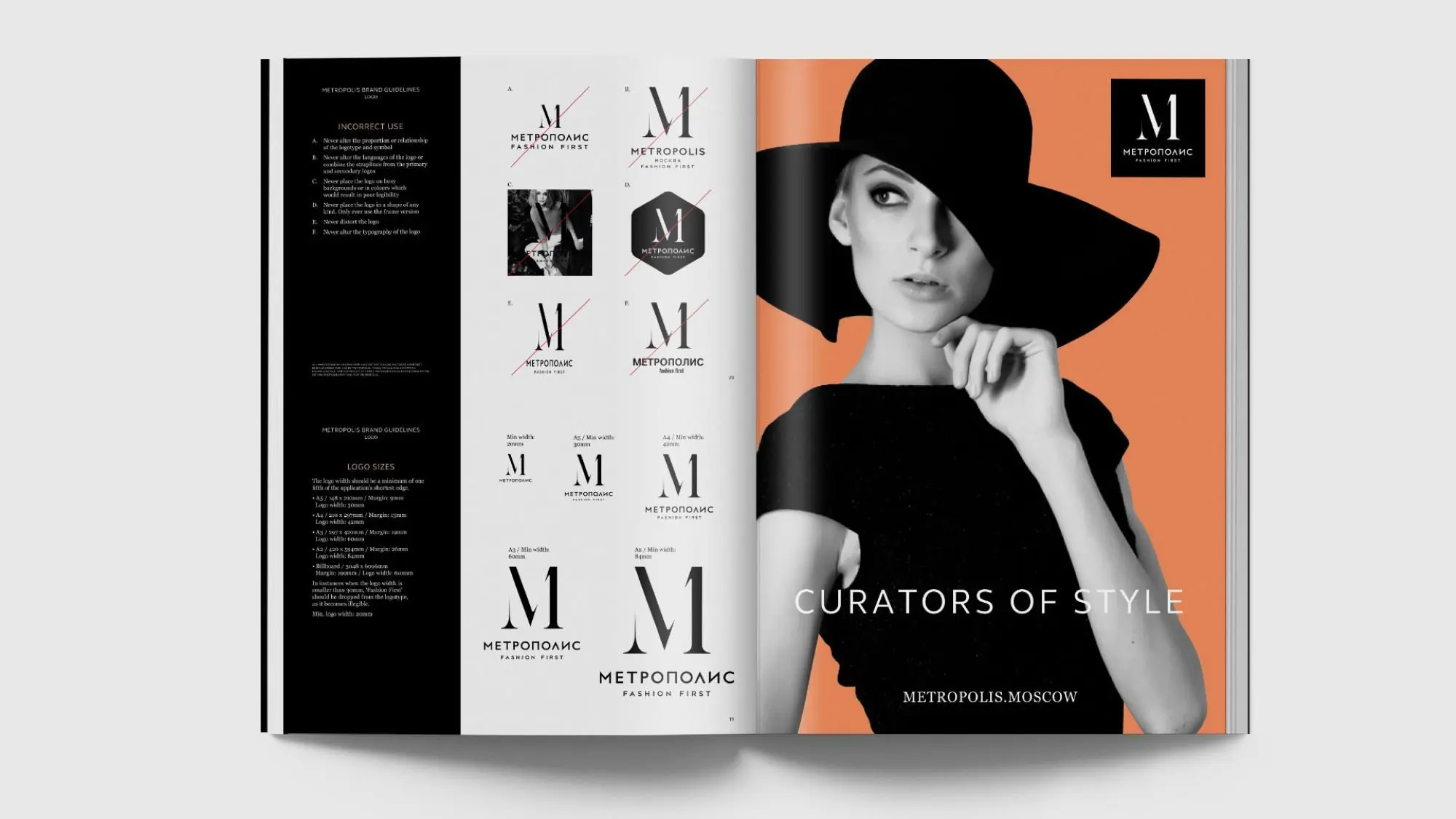
Fashion First was the core message and the visual identity is anchored by our M symbol which was designed with a deliberate fashion magazine masthead emphasis to really crystallise the Fashion part of the message. There’s also a subtle reference to the ‘First’ part in the symbol.
Can you see it?