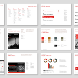
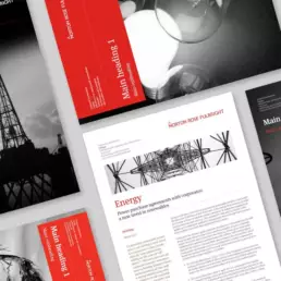
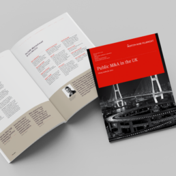
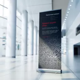
As we continue to celebrate our 21st anniversary, this week we are travelling back to 2002 to rediscover the branding we developed for Norton Rose, now Norton Rose Fullbright.
We developed the branding system by working closely with Peter Martyr and Laura Shumiloff right at the start of their global expansion program and love the fact that the branding has been able to support this adventure with the marque carefully managed and evolved, but essentially unchanged in nearly 20 years. It is a testament to design for the long term and good brand management by the NRF team over the years.
The original story behind the chevron, or hat over the N in Norton has a bit of history too. Back in the day Norton Rose was famed for its shipping legal work and when we started our redesign the existing logo was a ship’s compass rose in blue. The chevron is a humble vestige of that old tradition, symbolising the compass rose north arrow, whilst also being a positive symbol of progress and onward movement. A nice way to subtly honour your past whilst also looking toward the future.
In 2013, Norton Rose merged with Fulbright Jaworski which saw our last update of the brand guidelines. They are now one of the world’s leading international law firms; the 2nd largest in the US and a global top 10 practice with more than 4000 lawyers in over 50 global offices with revenues in excess of US$2 billion.
Only Alan (the A in Air) and Jonny Ellison, who is now the head of our wayfinding team, were part of the project’s original design team. Having now been involved in over 100 design projects, Jonny joined our Air family back in 2000 and this year he is also celebrating 20 years working at the company! He continues his hard work with wit and humour, never failing to put a smile on all our faces.

